About
Sendpoint Logo Project

Overview of Sendpoint Logo Project
My friend Charles DuPont asked me to make some logos for his business. He provided me with some pre-existing logos, copy, and general concepts for how he wanted the logos to feel. He wanted the logos to feel inspired by skateboard culture and had a few colors picked out for his branding.
Images
This is one of the original logos he designed
This is a logo he sent me as inspiration. I tried to incorporate the bright colors and simple shapes.
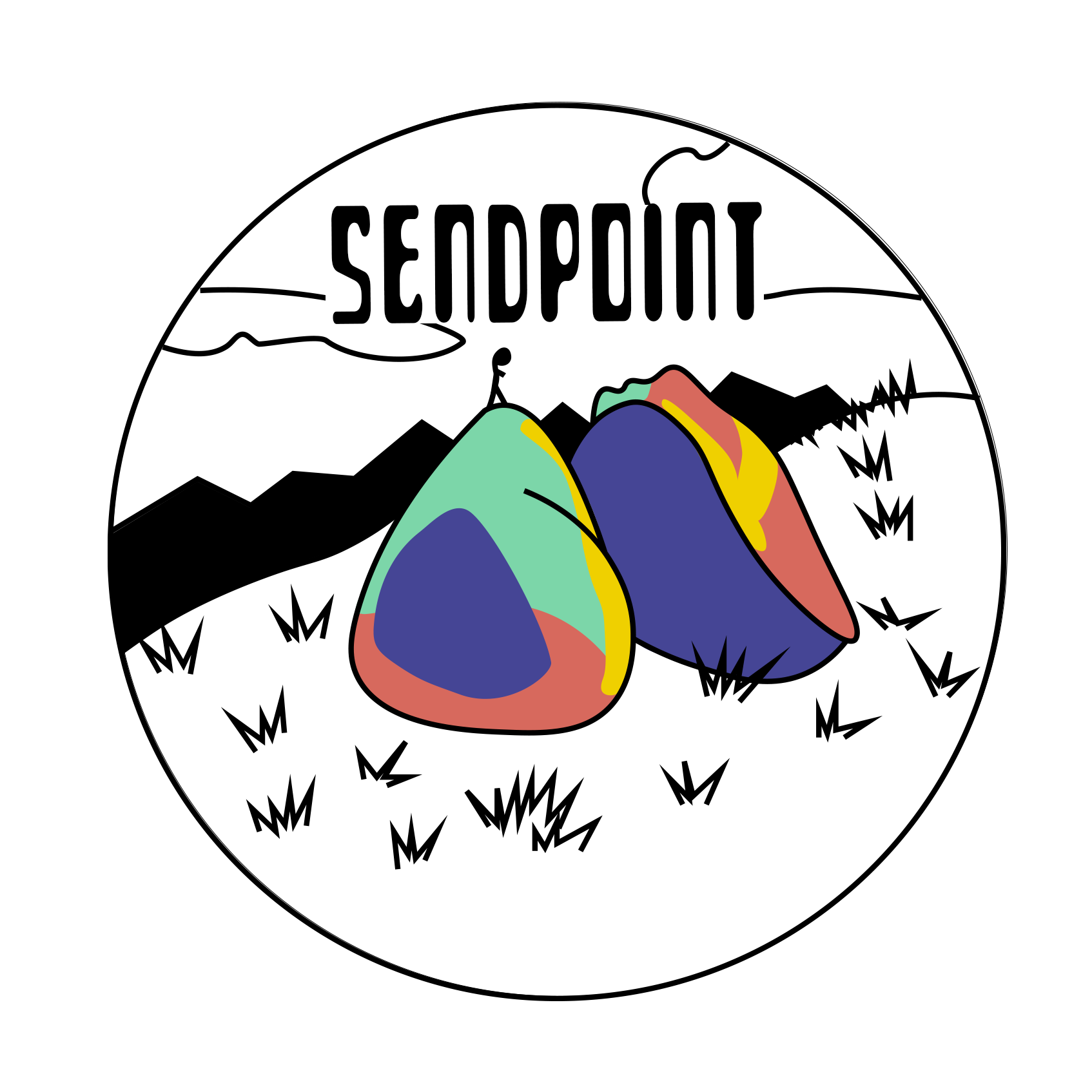
This is the first logo I came up with for him. It's inspired by the one he sent me and it's an image of some famous boulders in Bishop Colorado. All of the logos are rock climbing related since that's a major part of his business.
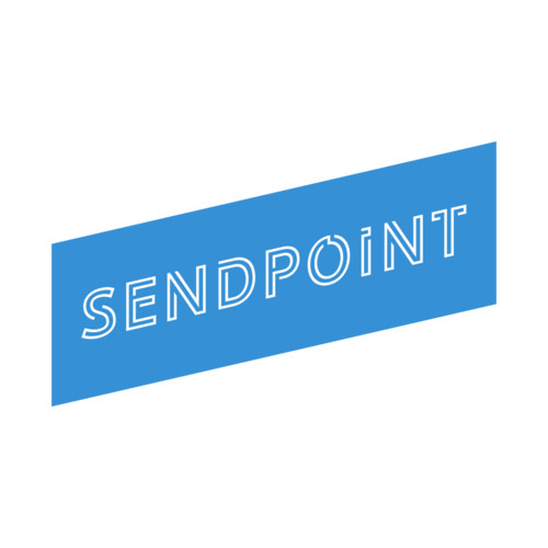
He also wanted a simpler logo, so I made this one inspired by the font he used for the one he sent me. It fit the skater-inspired look he was going for.
Since he wanted to give me a lot of creative control and asked me to make something cool this is the final logo I made for him.
Audience
- Designing for Climbing Enthusiasts: My design approach for the SendPoint project revolved around capturing the essence of rock climbing to resonate with the climbing community.
- Focusing on Climbing Coaches and Guides: The logos were crafted with the intent of appealing to coaching and guiding services, making SendPoint an attractive platform for their offerings.
- Merging Hip and Skater Aesthetics: The design direction incorporated hip, skater-inspired aesthetics while keeping a strong emphasis on rock climbing, creating a unique and appealing blend.
- Embracing Climbing's Counter-Cultural Spirit: I aimed to ensure that the designs resonated with the climbing community's counter-cultural spirit, embracing the individuality and creativity of climbers.
- Prioritizing Uniqueness and Creativity: Throughout the project, my focus was on providing a fresh and creative visual identity that would stand out in the world of climbing, which is known for its passionate and unique individuals.
Approach
Approaching the SendPoint project, I started with a series of thumbnail sketches to explore diverse design concepts. From these sketches, I selected the most promising ideas to develop into fully-fledged designs. This process enabled me to craft a visual identity that encapsulated the essence of rock climbing while infusing it with the desired skater-inspired aesthetics.